Welcome to our very first blog on scOrange, a visual programming environment to explore single-cell sequencing data sets without writing a single line of code!
Many questions related to organism development, evolution, disease progression or cell population heterogeneity cannot be answered with traditional, bulk sequencing protocols. The emerging single-cell RNA sequencing (scRNA-seq) assays greatly improve the resolution, as one can investigate transcriptome profiles on an individual cell level. This brings new challenges for computational analysis methods, as the resulting large gene expression matrices provide exciting opportunities for data visualization and modeling. ScOrange aims to provide the single-cell community with a user-friendly environment for exploration, analysis and machine learning.
Exploratory data analysis hinges on effective data visualizations, so let us dive straight in!
The principal input to all workflows in scOrange is a gene expression matrix, quantifying the expression of each gene for each cell (or other biological unit) in the sample. It presents a standard output of many open and commercial protocols.
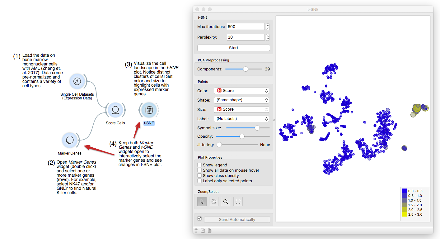
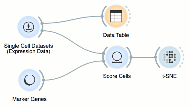
Let us start by loading and example data set from the Single Cell Datasets
widget. The data contains gene expressions in bone marrow mononuclear cells
from a patient with acute myeloid leukemia (AML), a blood cancer, and two
healthy donors used as controls (Zheng et al., 2017). We can first observe the
gene expression matrix and associated metadata in a Data Table.
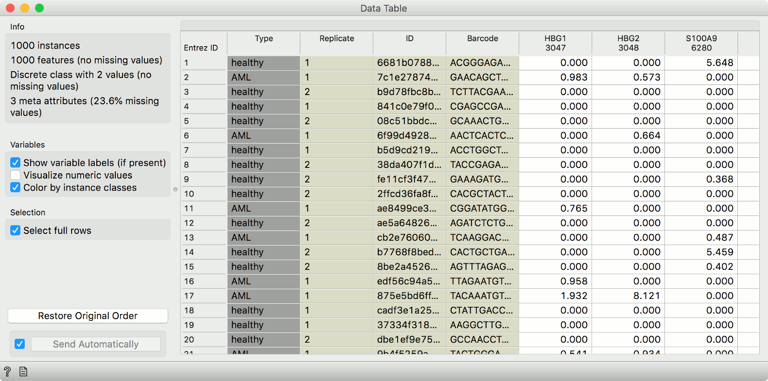
These example data have already been preprocessed, so that the expressions are comparable across cells and genes.
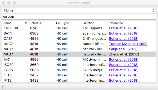
We can then load some known marker genes that will soon help us identify
populations expected to be present in these data. The organism we are working
with here is human. Then we can select a set of marker genes from the list. Let
us go with NKG7, which will reveal Natural Killer (NK) cell populations.
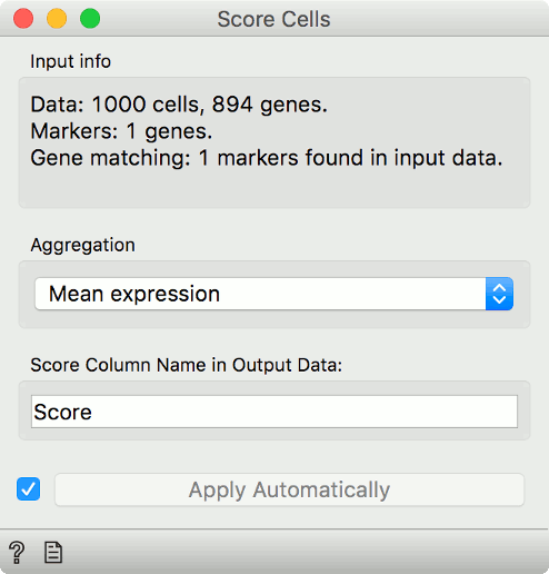
Now, connect first the Single Cell Datasets to Score Cells and then the Marker
Genes widget. Score Cells will match gene names and score genes with the
maximum expression level from the reference data.
Finally, we can observe the results in a visualization. The t-distributed Stochastic Neighbor Embedding (t-SNE) projects multidimensional data in a 2D plane in a non-linear fashion, emphasizing similarities between groups of most closely related cells. We get nice and compact clusters. But what is even better is that we can color them by the score and associate them to known cell populations!
Let us set color and size to the Score attribute. Yellow cells are those that have high expression for the select gene markers, clearly revealing a population of NK cells.
You can improve the accuracy of marking by selecting multiple marker genes - use the search bar to find more genes related to NK cells.
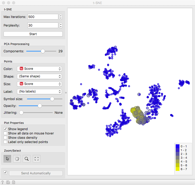
Now to exploit the full power of interactivity. Keep the Marker Genes widget open, select a different set of genes and observe the result with t-SNE. We leave it to you to find out whether there are T cells or B cells in this blood sample.
Follow our blog for more examples of interactive exploration of cell diversity!
References
Zheng, Grace XY, et al. “Massively parallel digital transcriptional profiling of single cells.” Nature communications 8 (2017): 14049.