Note: This blog is in many ways a continuation of our previous blog Identification of Cell Populations in Healthy Bone Marrow , therefore it is advisable to read it before tackling this one.
Batch effects can be a real nuisance when producing t-SNE plots of multiple data sets. In today’s blog we will show how to bypass them in scOrange by projecting single cell data set from an AML patient onto a t-SNE of healthy individual’s bone marrow cells clustered according to the cell type we have generated in our previous blog.
We will be using the same data as in our previous blog gathered by Galen et al. (Cell, 2019) which is available in the GEO database under the accession number GSE116256. More accurately, we will be using the data as we annotated it after clustering in the last blog. We need the annotated data from the healthy subject (BM4) and one AML patient (AML556) before, 15 days after and 31 days after undergoing chemotherapy. If you want to skip recreating the whole workflow from our previous blog, just use the Merge Data widget to merge the data from the healthy person with its annotation file. If you followed the previous workflow, use the Save data widget after the Merge Data widget to export the annotated data.
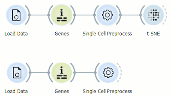
We have to load the data from the healthy individual and from the AML patient before the chemotherapy separately. Then run both datasets through the Genes widget, normalise it on counts per million and put it on a logarithmic scale in the Single Cell Preprocess widget. Now we can make our primary t-SNE projection from the data of the healthy individual.
Next, we use the t-SNE projection of the cells from the healthy individual as a template for assessing the cells from the AML patient by using the Apply domain widget.
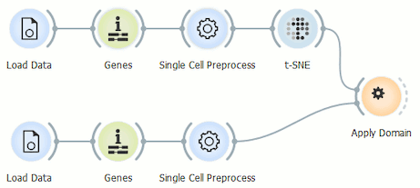
Before we display the data, we have to merge it using the Concatenate widget, where we select the append data source ID so that we can display this selection in the Scatter Plot widget. t-SNE is our primary data input and Apply Domain our secondary data input.
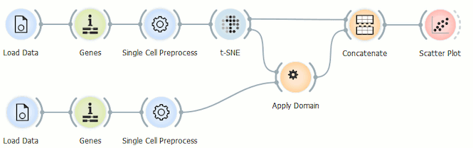
Because we don’t want to reexecute t-SNE and run into problems with the batch effect in doing so, we use the Scatter Plot widget to display the data and set t-SNE-x and t-SNE-y as variables for the x and y axis.
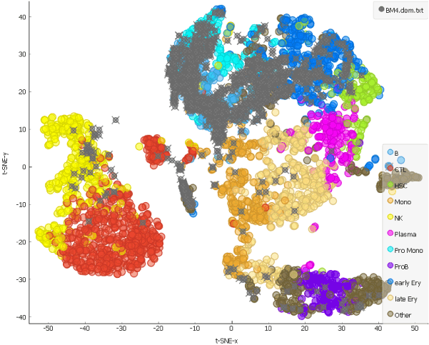
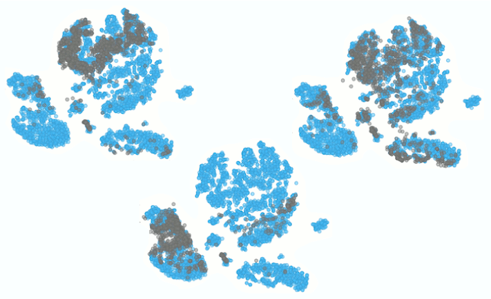
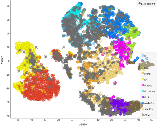
This is our projection of the single cell data from the AML patient before the chemotherapy onto the t-SNE of the cells from a healthy person. The projected cells are displayed as grey crosses. By using the dataset sampled on 15th day after the patient has first undergone chemotherapy, we can explore how the therapy affects cell populations.
Looking at the clustering pattern from our earlier blog, we can conclude that the cells here are predominantly T and natural killer cells, which is consistent with clearance of the cells during the chemotherapy.
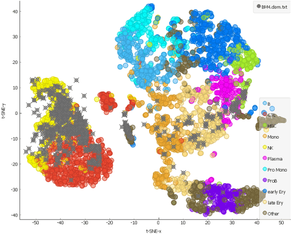
And how about a month after the chemotherapy?
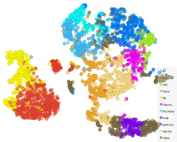
The hematopoietic stem cells have repopulated and, as we can see from the distribution of the grey points on the t-SNE representing cells from the patient, formed different cell types.
In short, we have shown how to display the cell types with the help of t-SNE and a pre-existing reference data set with known cell types.
References
Van Galen P, Hovestadt V, Wadsworth MH, et al. (2016). Single-Cell RNA-Seq Reveals AML Hierarchies Relevant to Disease Progression and Immunity. Cell, 176(6), 1265–1281.